Carnival.com
My task is to redesign Carnival.com’s website to improve the visual aesthetics and enhance user experience.
Carnival.com is the official website of Carnival Cruise Line, serving as a central hub for exploring cruise offerings, booking trips, and accessing destination information. The goal of this project was to redesign the website to enhance visual aesthetics, usability, and responsiveness across various devices.
OVERVIEW
ROLE
UX/UI Designer
RESPONSIBILITIES
UX/UI Design, Usability Testing, Wireframeing, Prototyping
PROJECT
Responsive Web Redesign
TIMELINE
2 Weeks
THE PROBLEM
One of the most obvious problem was the poor user interface, the interface lacked appeal due to an abundance of promotional animations, alongside less visually appealing text.
To address this issue,
it's crucial to re-evaluate the current website the usability in order to identify area of improvement and enhance user satisfaction and overall functionality.
DESIGN CHALLENGE
How might we present the content in a more comprehensive way for vacation-goers using carnival.com?
THE SOLUTION
After properly understanding the problem statements and market researches, the main goals of the website redesign were established.
Redesign homepage layout
Improve visual element hierarchy
Iterate display of promotions
Iterate Search Field
THE PROCESS
Phase #1 - Discover
🔍 Research & Analysis
Usability Testing
User Interview
Competitive Analysis
Card Sorting
Phase #2 - Define
🎯 Synthesize & Problem Framing
Identify Problem
User Persona
Phase #3 - Develop
💡 Ideation & Design
Lo-Fi Wireframes & Prototyping
Early A/B Testing
Phase #4 - Deliver
🚀 Testing & Handoff
Usability Testing
Iteration & Refinement
Hi-Fi Mock Ups
RESEARCH
5 moderate user interviews revealed a strong user desire for more comprehensive information about cruise offerings and enticing deals.
THE GOAL:
Learn traveler's expectations when booking for a vacation; such as flights tickets, hotels, rentals, and activities.Users did not feel the homepage provided sufficient information about the cruises.
Learn why travelers prefers specific travel websites.
I initiated the process by conducting extensive research methodologies to identify key issues and problems with the current website. Some of the methods I used included:
User Interview
Usability Testing
Insights from User Interviews
60% of users reported a strong desire to compare prices.
Travel website's like Expedia and Booking.com offers variety travel packages.
60% of users feel the large and bolded texts are aggressive, making it difficult to navigate through the website.
80% of users found it difficult to locate desired cruise information on the homepage
Users were distracted with the amount of promotional animations on the homepage.
60% of users would compare prices across multiple travel websites to find best deal.
COMPETITIVE ANALYSIS
I analyzed two popular travel websites and two cruise websites to gather insights and identify potential opportunities for improvement.
By leveraging the insights from user research and a thorough competitive analysis, I identified potential opportunities to improve the current website design. Focusing on the most critical user pain points and areas where the website can gain a competitive edge, I have prioritized the following improvements:

CARD SORTING
To understand user expectations for content organization, I conducted an open card sorting research session using Optimal Workshop.
During this session, I provided a series of labeled cards representing key website information and asked participants to categorize and group these cards in a way that made sense to them. This process helped me identify the optimal information hierarchy for the redesigned Carnival.com website, ensuring a user-friendly and intuitive navigation experience.

MEET OUR PERSONAS
Creating well-defined personas is essential for designing products and experiences that meet the needs and expectations of target audiences.
Primary Persona, Shane
“Not only the service the travel website sells, but also recommendations, lots of content for amenities and activities”

Secondary Persona, Lily
“The most important aspect of a travel website for me is great deals, easy navigation, and a wide range of recommendations”

LO-FI WIREFRAMES
I created two explorations of wireframe designs to examine the design layouts to prepared for the A/B testing to assess the effectiveness of the solutions.

A/B TEST RESULTS
The majority of users expressed a preference for the second exploration of the wireframe designs.
I conducted A/B testing to assess two versions of the design layout to determine which one performs better based on user expectations and experiences.
My key observations:
Users found the layout of the second exploration to be more intuitive and user-friendly compared to other versions.
Commonly suggested tweaks for the layouts included:
Adjusting the placement of navigation elements for easier access.
Increasing the prominence of important features such as booking options and destination information.
Enhancing visual cues and feedback to improve navigation and user engagement.
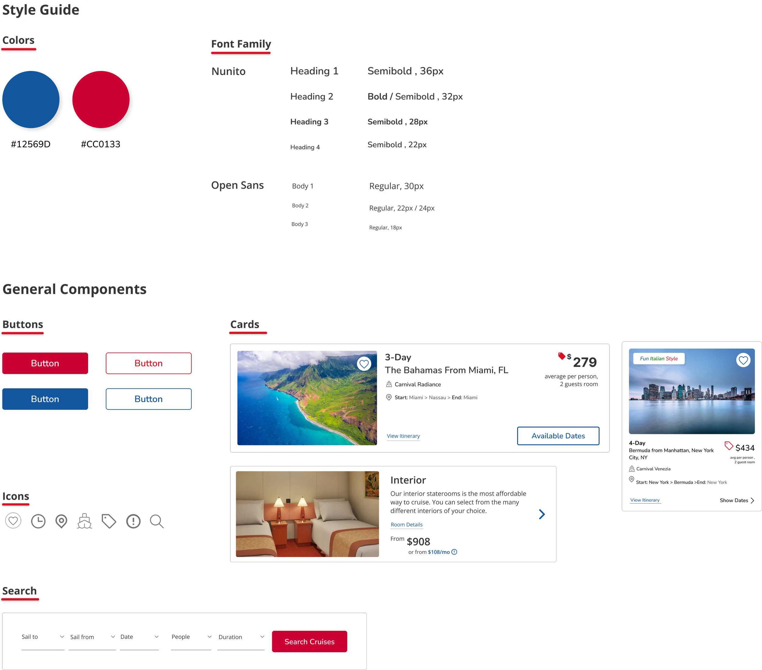
HIGH FIDELITY WIREFRAMES
After analyzing the usability test results, I iterated the designs based on user feedback to create the finalized outcome for both desktop and mobile screens.


FINAL THOUGHTS.
Redesigning carnival.com's website was a valuable opportunity to enhance my skills in designing for responsiveness. While adhering to the existing design system, I also had to consider various factors, including user experience, accessibility, and mobile optimization, to ensure a seamless browsing experience across different devices. Additionally, I focused on improving navigation, enhancing visual appeal, and optimizing performance to meet the diverse needs of users. Overall, this project provided a comprehensive learning experience in web design and development.
The next phase involves iterating on the revisions derived from the test results to enhance the interface and elevate the user experience further.