Spotify
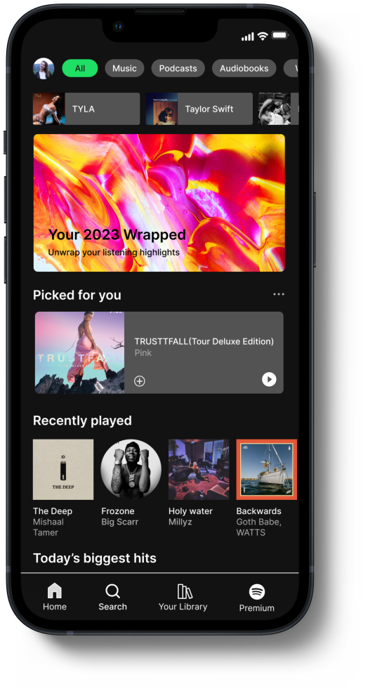
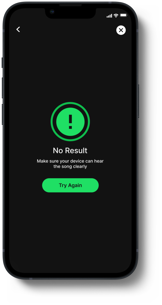
A more convenient and efficient experience within the app, enabling users to quickly identify songs with minimal typing and effortlessly add them to their playlists.
OVERVIEW
In this project, I took the initiative to improve Spotify’s song identification experience as a UX/UI Designer. Taking on the full ownership, I utilized user insights to develop innovative concepts, transform them into refined designs, and conduct thorough testing for optimal performance to enhance user experience.
ROLE:
UX/UI Designer
RESPONSIBILITIES:
UX/UI Design, user research, wireframing, prototyping & Testing
PROJECT:
Add A Feature
TIMELINE:
2 Weeks
The Problem
Users experience frustration with the music discovery process due to multiple attempts and the necessity of using external applications, which disrupts their seamless experience and adds complexity to finding and enjoying new music.
The reliance on external applications for music identification adds an extra layer of complexity, creating a less integrated and seamless experience. Users desire a more cohesive and efficient way to discover and identify music without having to rely on third-party tools or endure repeated attempts.
To address this issue,
it's crucial to enhance user satisfaction and overall functionality within the app. By streamlining the process and minimizing the need for external tools can provide a more intuitive and satisfying experience for users.
DESIGN CHALLENGE
How might we make the song identification to be the most rewarding experience for individuals?
THE SOLUTION
Audio Identification provides a more convenient and efficient experience within the app, enabling users to quickly identify songs with minimal typing and effortlessly add them to their playlists.
The GOAL
Enhance music discovery experience for users.
Time-efficient ways to identify songs.
Improve user convenience for song identification.
Deliverables
THE PROCESS
Discover
🔍 Research & Analysis
User Interview
Competitive Analysis
Define
🎯 Problem Framing
Affinity Mapping
Identify User Pain Points
User Persona
Empathy Map
Develop
💡 Ideation & Design
Feature Conceptualization
Lo-Fi WIreframes & Lo-Fi Prototyping
Early Testing
Deliver
🚀 Testing & Handoff
Usability Testing
Iteration & Refinement
Hi-Fi Mock Ups
RESEARCH & ANALYSIS
To approach this problem, it was crucial to understand the criteria people seek in their experiences with song identification process. I conducted comprehensive interviews and extensive analysis to gather insights and synthesized the findings to understand user struggles with song identification.
I conducted user interviews with 5 moderate users and they revealed that they often rely on alternative methods for identifying songs.
User Research Takeaways
Around 60% of the users rely on secondary resources/app for song identification.
Over 80% of the users manually type lyrics to search for songs.
Typically, it takes 2 - 3 attempts to identify a particular song.
Individuals often abandon the effort when unable to identify a desired song.
COMPETITIVE ANALYSIS
Having grasped the challenges users encounter with song identification, I dedicated time to conduct in-depth analysis of competitors and third-party application, as highlighted during the user interviews, to gain a deeper insight into their approach of song identification process and found that the current trending music applications work with a third party application for faster song identification to enhance the user experience.
Key Findings
Apple Music utilizes "Shazam" and ‘Siri” for song identification.
YouTube Music offers Shazam-like feature for identifying songs.
Amazon Music and Tidal rely on third-party apps like Shazam or SoundHound for song identification.
I then proceeded with further analysis with the third party app.
I analyze the functionalities of “Shazam” and “SoundHound” and their approach to song identification process and mobile interface revealed:
Song Identification approach:
While Shazam focused on speed and efficiency, SoundHound offers greater flexibility and detailed informations.
User Interface approach:
Shazam focused on minimalist designs to avoid cluttering the screen with unnecessary information.
SoundHound displays comprehensive information about identified so, including lyrics, artist biography, and related videos.
Despite Spotify’s robust search functionality. Users still find it frustrating not being able to quickly identify songs. They had to manually type in the keywords or rely on a third party song identification application for song identification.
USER PERSONA
EMPATHY MAP
After creating the persona, I developed an empathy map to aid in the design process. This tool helps illustrate what the user is thinking and doing on a daily basis and provided valuable insights that guided my design decisions.

DESIGN
To ensured the alignment with the current design system and layout. The new design enhancements had to create a seamless integration.
LOW FIDELITY WIREFRAMES
I experimented with different layouts to ensure the new feature integrated seamlessly with the existing design system.
TEST
Usability testing revealed that users were satisfied with the seamless integration of this new feature and found that the feature is useful, intuitive, and user friendly.
USABILITY TEST
I conducted usability tests with 5 moderates with a scenario based task flows to collect valuable user feedback and insights for this new.
1. Identify songs.
Task:
Use the audio search function to identify song.
Task Completion rate:
100%
Observation:
Users could easily locate and utilize the audio identification and search feature.
Feedback:
User suggested to update the “Tap to Identify” to “Tap to Listen” for quicker recognition.
2. Add the song to an existing playlist or create a new playlist.
Task:
Next, add the identified song to the existing playlist or create a new playlist.
Task Completion rate:
100%
Observation:
Users were able to quickly identify where to take action to add or create a playlist.
Feedback:
Align the icons together in a horizontally line for better visual consistency and a cleaner layout .
3. Find the Artist Bio.
Task:
Find the Artist Bio.
Task Completion rate:
100%
Observation:
User’s understood that they would have to go back to the song information screen or the play screen to tab the artist name to view the bio.
THE OUTCOME
The new audio song identification feature effectively addressed user’s frustrations and delivered an intuitive experience, supported by user feedback. This solo project showcased my proficiency in driving comprehensive UX/UI design initiatives, from research and persona development to implementation and refinement. My dedication to understanding user needs and tailoring solutions accordingly was pivotal in delivering a feature that notably enhanced the user experience.
WHAT I LEARNED
Conducting secondary competitive analysis research is crucial for gaining insights into competitors' strategies, strengths, and weaknesses. It helped me to identify opportunities, threats, and gaps in the market, informing product development and marketing strategies. However, when the analysis did not provide sufficient guidance for the project scope, further research was necessary to gain deeper insights into competitors' approaches to their products.


