OVERVIEW
Our product is a comprehensive, one-stop solution for dog owners, designed to simplify and centralize the management of all dog-related activities. By addressing the current gap where dog owners rely on multiple tools and apps to manage their pet's needs, our solution offers a seamless, user-friendly experience that saves time and ensures every aspect of dog care is efficiently handled in one place.
Product Manager
Product Designer
2 Developers
TEAM
RESPONSIBILITIES
Research, User Stories, User Flow, Wireframe, Mockups, Brand Identity, UI KIT, User Testing, Deliverables
PROJECT
Web Application
TIMELINE
1 month
PawHub
Your One-Stop Solution for All Dog Care Needs.
THE PROBLEM
Pet owners face significant challenges in efficiently managing their pet's care due to the lack of a centralized solution.
With pet ownership on the rise, managing pet care has become increasingly complex and fragmented. The market is growing, and there is a strong demand for a streamlined digital solution. Addressing this now allows us to capitalize on market trends and improve the lives of pet owners.
DESIGN CHALLENGE
The How Might We.
I crafted this statement to guide my design direction, focusing on user needs and the functionality required for an intuitive, efficient solution.
How might we help dog owners easily organize and access their pet’s medical records, appointments, and activities while providing timely reminders and seamless access to essential pet services?
THE GOAL
Understand the Overwhelm
I set out to explore ways to help dog owners struggling to manage their dog’s information, enabling them to better organize and keep track of all dog-related activities.
Research Objective #1
Understand the common challenges dog owners face when taking care of their dog.
Research Objective #2
Explore what specific types of information dog owners need to track (e.g., medical records, diet plans, grooming schedules).
Research Objective #3
Does dog owners use any dog management application to help them better manage their dog’s information?
THE SOLUTION
PawHub provides a centralized platform that allows dog owners to manage their pet's information, schedule important events, track medical records, and find nearby dog-friendly locations.
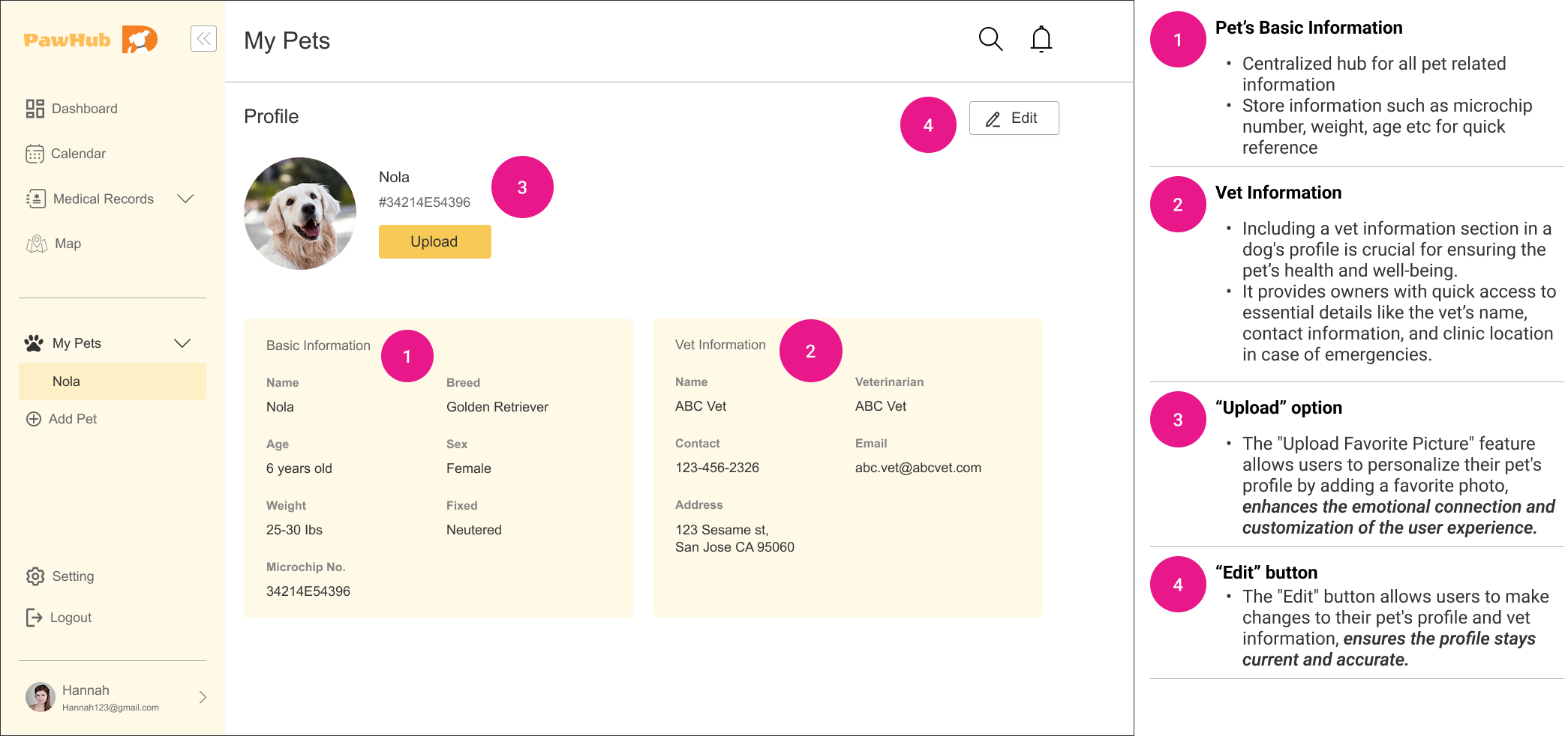
The Profile
Medical Record
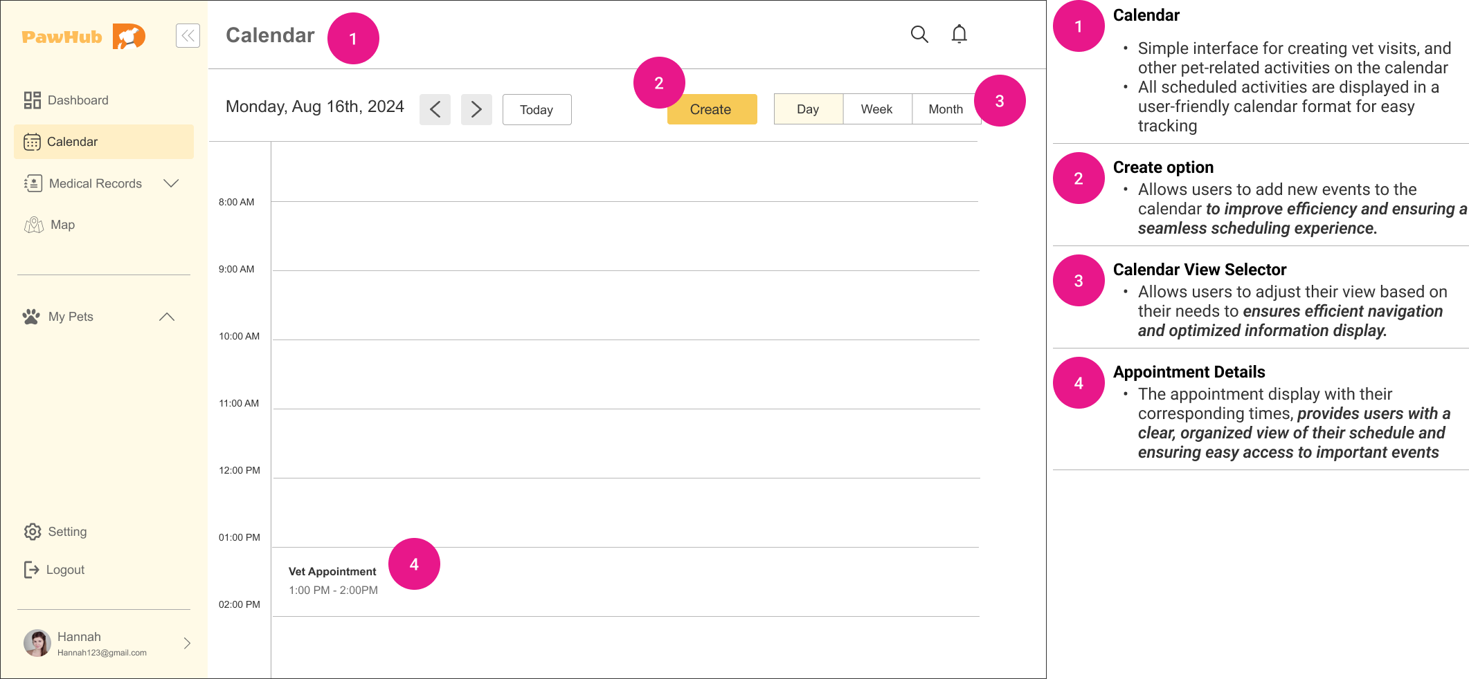
Calendar
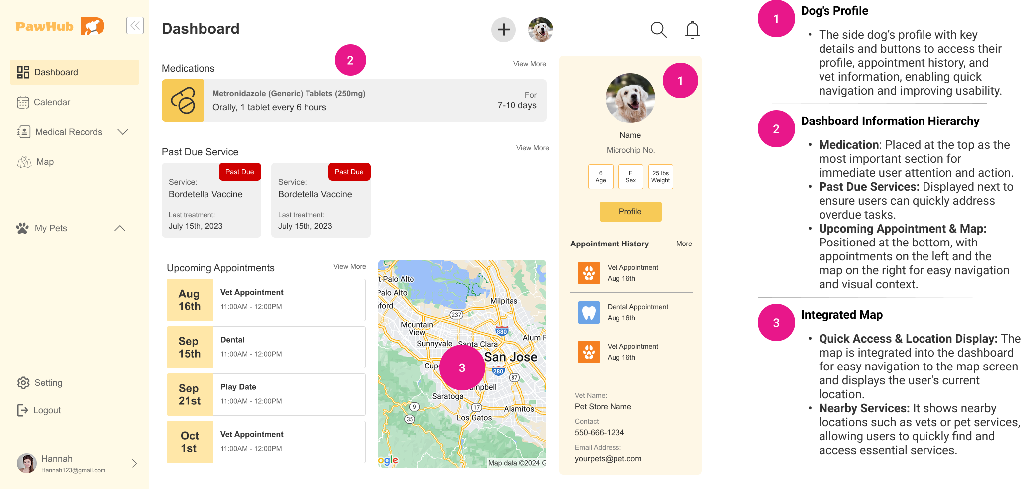
Dashboard
THE PROCESS
Phase #1 - Discover
🔍 Research & Insights
Competitive Analysis
User Interviews
Surveys
Phase #2 - Define
🎯 Synthesizing & Problem Framing
Identify the Problem
User Persona
User Stories
Phase #3 - Develop
💡 Ideation & Prototyping
Feature Set
User Flows
Wireframing & Prototyping
Phase #4 - Deliver
🚀 Testing & Handoff
High-Fidelity Mockups
Usability Testing
Iteration & Refinement
Discover
RESEARCH & ANALYSIS
There’s significant gaps exist in current dog care applications. In user research of 45 people, 72% of dog owners stated that consolidating all pet care information in one place as their biggest challenge.
COMPETITIVE ANALYSIS
STRENGTH
These applications excels in their focused area.
A reliable platform that offers real-time updates for transparency.
Ease of use and user-friendly interfaces which makes it easy for user to navigate.
We evaluated pet care applications include DogLog, Wag, Whistle, and PetDesk to focus on their features, usability, and overall user experience and identified their strength, weaknesses, opportunities, and threats.
WEAKNESS
Applications have specialized focus which limited their functionality in other areas.
Limited data consolidation leading to fragmented user experience.
Lack of engaging visuals or customization options.
OPPORTUNITIES
Streamlining interfaces and incorporating engaging visuals to elevate the user experience.
Enhance feature offerings and professional services to make the applications more attractive to a wider audience.
THREATS
Stronger competition, low brand awareness.
Regulatory risks, high competition from platforms like Rover.
Competition from broader apps, limited vet partnerships.
USER INTERVIEW & SURVEY
To deepen our understanding, we conducted further user interviews and surveys to gather insights into user’s personal experience with managing their dog’s care.
Sample interview questions…
How do you currently manage your dog's daily care and health activities?
What are the biggest challenges you face in managing your dog's care and health activities?
Insights revealed the limitations with apps currently available are:
Too many Apps
Poor User Experience
Lack of Integration
Limited Support
Define
USER PERSONAS
Who are we helping?
In order to ensure that both the research and any proposed solutions were firmly aligned with the users’ stories and needs, I created two personas to help define and prioritize what problems to solve for. Having their current challenges highlighted helped to keep ideas and development firmly targeted towards their needs.
"I just want something that keeps track of everything for Max in one place and reminds me about appointments so I can stay focused on work and family without constantly worrying."
- Sarah J.
"I want something that just works with everything I already use. I don’t have the time or patience to manually track Luna’s vet visits and medications."
- James R.
USER STORIES
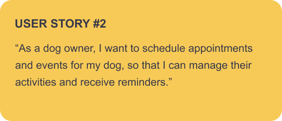
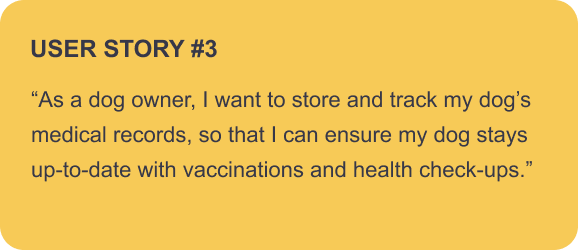
To ensure that the solution would meet the needs of our target audience, I collaborated with the PM to create user stories based on feedback from interviews and surveys to further guide my design decisions.
Develop
IDEATE
With a solid understanding of my users and their pain points . I started to brainstorm potential ideas and came up with possible solution.
Feature Conceptualization
With a clear understanding of our users' stories, I brainstormed some key features that could effectively address and solve user needs.
Centralized hub for all pet related information.
Store information such as microchip number, weight, age etc for quick reference
Pet Profile
Keep all medical records, vaccination dates, and health check-ups in one secure location
Upload and store digital copies of medical documents, such as vaccination certificates and test results
Medical Record
Simple interface for creating vet visits, and other pet-related activities on the calendar
All scheduled activities are displayed in a user-friendly calendar format for easy tracking
Calendar
Find Nearby Pet Services like dog parks, clinics, stores etc based on the current location
Integrated Google Maps to view services on a map with real-time directions and distance information
Map
USER FLOW
Flow #1
With the user stories and key features developed, I mapped out the user flows to ensure the design effectively supports the paths users take to complete tasks.
Create an account
The user would like to sign up with an account so they can start managing their pet’s profile.
Flow #2
Edit pet’s profile
The user would like to make changes/update their pet’s information and the vet’s information.
Flow #3
Add new event /appointment/activities
The user schedules a vet appointment and wants to add it to their pet management application, including details such as appointment type, date, time, and address. They also choose to enable notifications as a reminder to ensure they don’t miss the appointment.
Flow #4
Add new medical record
After the vet visit, the user wants to upload the medical record and receipt to the pet management application, including details such as the visit date, type of service, follow-up date, fees, and the receipt for future reference.
LO-FI WIREFRAMES
The low-fidelity wireframes provided a simplified visual guide for the application’s Interface, allowing us to focus on essential elements like navigation, content hierarchy, interactions, and user flows without getting into detailed visual design. Each screen prioritizes functionality, ensuring that the design aligns with user needs and supports intuitive navigation throughout the application.
Sign Up
A simple structure for user to input minimal information to sign up.
Pet’s Profile
A simple layout for pet basic information and vet basic information
Provides different view types based on user preference and quick view of activities/events/appointments.
Calendar
Medical Records
Table data layout for quick overview and slide in drawer to add new records.
Dashboard
A comprehensive view to display important information.
A simple layout where the user can either search or select the predefined categories to quickly search for nearby dog services.
Map
Deliver
DESIGN SYSTEM
The design system comprised a set of reusable UI components, guidelines, and standards that defined the application's aesthetic and functional elements. By standardizing components such as buttons, form fields, and navigation menus, we created a cohesive look and feel throughout the application.
HI-FI MOCKUPS
The high-fidelity mockups built upon the structural foundation laid by the wireframes, incorporated polished visual design elements to enhance the overall user experience. The mockups allowed for more accurate user testing and further refine the designs based on feedback while maintaining alignment with the brand’s aesthetic and business goals.
Sign Up
A quick and easy onboarding process with the CTA button.
This feature allows users to store detailed information about their pet, including microchip number, weight, age, and more, for easy access and quick reference.
Pet's Profile
Medical Record
This feature enables users to securely store all medical records, vaccinations, and health check-ups in one place, including uploading and organizing digital copies of documents such as receipts, vaccination certificates, and test results for future reference.
Calendar
This intuitive calendar interface enables users to create and manage appointments, vet visits, and other pet-related activities. Scheduled events are presented in a user-friendly calendar format, making it easy to track, view, and edit them.
Dashboard
The dashboard consolidates key details like medications, overdue services, upcoming appointments, and a quick overview of the pet's information, providing faster and easier access in one place.
Map
Discover nearby dog services using integrated Google Maps, complete with real-time directions and distance details displayed on the map.
TESTING
The feedback highlighted several strengths, including the comprehensive design and the intuitive, easy navigations. However, users also pointed out areas for improvement, allowing us to refine the application further to better meet user needs and expectations.
Usability Testing
Following the development of high-fidelity mockups, we conducted usability testing sessions with a diverse group of dog owners to gather feedback on the application’s usability and overall experience. Participants expressed satisfaction with the navigation and usability. They were able to complete the key tasks while voicing their thoughts and suggestions.
Feedback #1
“Simple is good, but not too plain”
Overall, I love the simplicity of the app and the easy onboarding process. However, the initial onboarding background is a bit plain.
Feedback #2
The medical record looks great! I suggest adding a section where multiple services can be recorded. This is important because a vet visit may involve several services being performed on the same day.
Feedback #3
The dashboard is excellent and very intuitive. However, I believe that the medication section should be positioned at the very top, as timely medication administration is crucial. Overdue services can be addressed once their deadlines have passed.
ITERATIONS
Based on the feedback from user testing, I revised the high fidelity wireframes of the MVP for our app.
Implemented background to the Sign Up for better visual.
Rearranged the information hierarchy and added more icons to the Dashboard.
Rearranged the information hierarchy in the data table and added an “Add Service” button, allowing users to include multiple services in one record from one vet visit.
Current Metrics
+ 27%
Overall User Satisfaction
We conducted 2nd round of user testing and found that there was a 27% increase in overall user satisfaction.
What I learned
The importance of clear communication to stay aligned with the team. I learned to articulate my design decisions effectively and explain the rationale behind my choices based on research and user testing. Having clear communication on little details early on during the discovering and ideation space helps avoid setbacks and misalignments later in the process. Additionally, I realized that feedback loops are crucial for refining design elements, ensuring that the end product meets user needs and expectations. Collaborating closely with stakeholders and developers throughout the design phase helped me gain valuable insights and fostered a more cohesive team dynamic.
Next Step
The next step in this process is to prepare all the necessary documents and hand off to the developers. This involves having the detailed design specifications and assets to ensure a smooth transition from design to development. I developed comprehensive documentation that includes style guides, component libraries, and interaction guidelines to support the development team in accurately implementing the design. Additionally, I plan to schedule a walkthrough session with the developers to address any questions and clarify design intents. After the handoff, I will remain available for any follow-up questions or adjustments that may arise during the development phase to ensure the final product aligns with our vision. Finally, I aim to gather feedback from both the developers and users post-launch to iterate and further improve the application.
